Why the Fed Rate Doesn't Tell the Whole Treasury Story
The Fed's September hike and the Treasury curve tell different stories. A matched nominal-versus-real yield comparison shows what changed—and what it cannot prove.
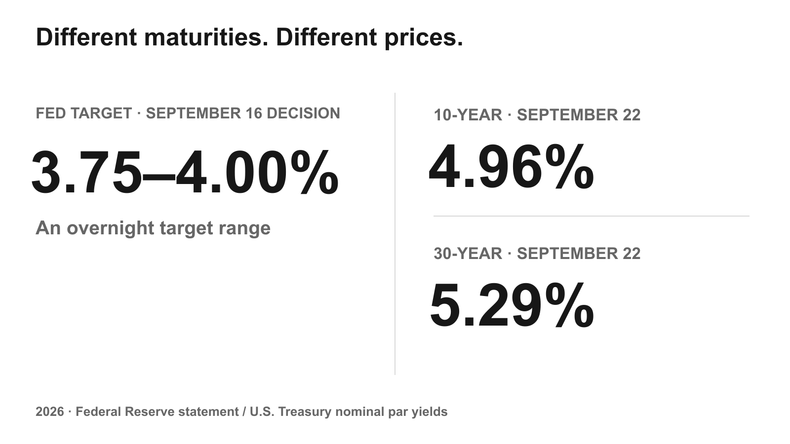
The September Fed decision has happened—and it was a hike. On September 16, the Fed raised its target range by 0.25 percentage point to 3.75–4.00%. Six days later, the 10-year Treasury yielded 4.96% and the 30-year 5.29%.
Those prices need not match. The Fed sets an overnight target. Someone buying a long Treasury is committing money across years of policy decisions, inflation surprises and changing demand for bonds. Reading that price from the next Fed meeting alone leaves too much out.
Updated September 23: this replaces the original September 1 observations and the then-upcoming September FOMC checkpoint. The original publication date remains September 2.
Start with the bond, not the meeting
A rate cut can help long bonds, but the size of the cut is not a formula for their return. A hike is not a formula either. What matters is how the market revises the years ahead, including how much extra compensation investors want for holding a long maturity.
Here is a narrower question we can actually check: when long yields rose this year, how much of that move appeared in the real-yield measure rather than the gap between nominal and real yields?
Source Evidence Snapshot — Two dates, the same maturities
The Treasury's nominal curve provides the starting values. These are annualized par yields, not the return an investor earned over the period.
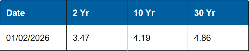

The 2-year rose from 3.47% to 4.71%, more than either long maturity. This was not simply a long-end story. The pair of rows also leaves out the route between them: it cannot show which meeting, inflation release or auction caused the change.
Real yields account for most of this comparison
Now put the nominal and TIPS-based real curves on matching dates.
| Maturity and measure | Jan 2 | Sep 22 | Change |
|---|---|---|---|
10-year nominal | 4.19% | 4.96% | +77 bp |
10-year real | 1.94% | 2.63% | +69 bp |
30-year nominal | 4.86% | 5.29% | +43 bp |
30-year real | 2.63% | 3.04% | +41 bp |
Data: Treasury nominal and real par curves. Changes are independent arithmetic; 1 bp is 0.01 percentage point.
At 10 years, the arithmetic is 77 = 69 + 8 bp. At 30 years it is 43 = 41 + 2 bp. The final term is the change in the nominal–real gap. Most of the rise between these endpoints therefore coincided with a higher real yield.
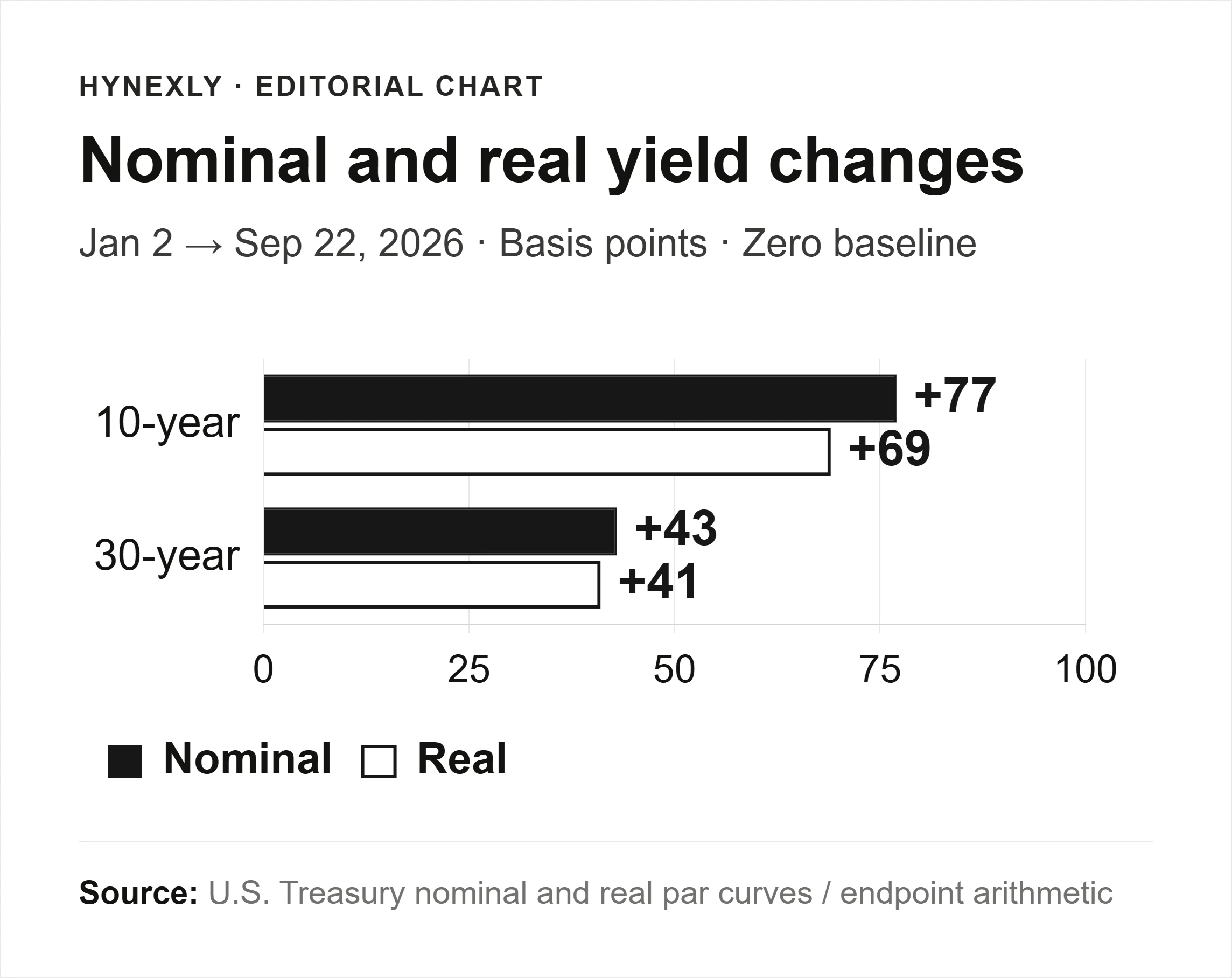
Calculation, not a source capture: nominal and real changes on one bp scale starting at 0. The chart compares two endpoints, not a time series or a forecast.
That is useful information, with a firm limit. Nominal Treasuries and inflation-linked bonds do not have identical liquidity or curve construction. Their yield gap is an approximation to inflation compensation, not a clean measurement of what investors expect inflation to be. The bars do not tell us why real yields rose.
Two ways to read the same yield
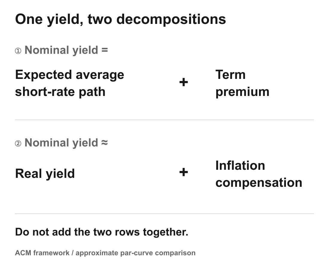
The New York Fed's ACM framework separates a Treasury yield into the expected average short-rate path and an estimated term premium: compensation for the risk of holding duration. That premium is model-dependent, not a directly observed market quote.
This is a different decomposition from nominal yield minus real yield. Mixing the two would count overlapping components twice.
Supply deserves a place in the discussion, too, but the numbers need their labels. Treasury's August 3 estimate was $739B of net marketable borrowing for July–September. The August 5 refunding announcement was $125B of gross securities, raising approximately $28.7B in new cash after maturities. Gross issuance and net borrowing are not interchangeable.
These announcements establish a financing requirement. They do not prove that supply caused the rise in yields. To test a supply explanation, we would need to follow actual issuance and demand as well as competing policy and inflation news.
What this does not tell a bondholder
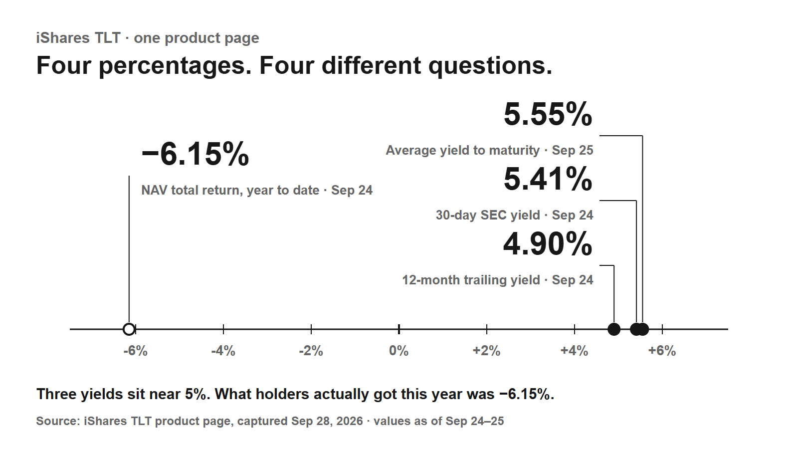
A high quoted yield is not a promise of a high return over your own holding period. The comparison above contains no purchase price, sale date or fund costs. It cannot decide whether a particular long-bond fund suits an investor. Our guide to reading ETF yields shows how a long-bond fund's printed yields differ from what its holders earned.
The endpoint choice matters as well. January to September describes a different move from the week around an FOMC meeting. Calling this a reaction to the September hike would turn an approximately 8-month comparison into an event study it was never designed to be.
And markets can move before the decision. A widely anticipated cut may already be reflected in prices; the message about later meetings can matter more than the announcement itself.
The next check is a calculation, not a prediction
The claim to revisit is specific: real yields accounted arithmetically for most of the long-yield increase over these dates. If the next comparison shows nominal yields rising while real yields barely move, that description no longer fits the new period. We should investigate the widening gap instead of recycling this article's explanation.
For a policy story, check the expected short-rate path and the latest ACM estimate separately. For a supply story, compare Treasury's estimates with issuance and demand as they become observable. Do not use a fall in one model component to dismiss the others.
| Question | What to compare | What would change the reading |
|---|---|---|
Is the real-yield component still moving? | Nominal and real yields on matching dates | Nominal rises while real is flat |
Is policy the explanation? | Expected short-rate path and a dated ACM estimate | The two components move differently |
Is supply the explanation? | Announced borrowing, actual issuance and demand | Financing or demand differs from the forecast |
The distinction carries into company analysis. The Circle reserve-income article examines a business tied to short rates; the bank earnings guide explains why different income and funding lines can respond differently to the same rate environment.
Method and limits
Reviewed September 23, 2026. Yield observations are January 2 and September 22 Treasury nominal and real par curves. Changes in bp equal the percentage-point difference multiplied by 100. No daily path, causal regression or bond-return estimate is implied. The Fed decision is from its September 16 statement; supply figures are dated August announcements, not realized quarterly totals.
AI assisted with source organization, chart production and bilingual checks. This is general educational research, not individualized investment advice, a rating or a price target.
Primary references cited or linked in this analysis. Click through to read each source in full.
Choose the next evidence gap to investigate.
One ETF Page, Four Percentages: What SEC Yield, Trailing Yield, YTM and Total Return Each Answer
On September 24, TLT showed a 5.41% SEC yield, a 4.90% trailing yield and a −6.15% year-to-date total return. What each number measures, why they differ, and the calculation that ties yield to rate risk.
Owner-operated US market research desk
Owner-operated US stock and market coverage built from public filings, SEC EDGAR, official reports, company releases, and market data.
- Source-grounded research with primary filings & official reports
- Bilingual EN / KO editorial workflow
- Manual editorial QA before publish